
‘Hidden disability’? For one in five people! by Theodore J. Cohen, Ph.D.
Can you read this?

Some people can, but not without considerable difficulty.
The text above was rendered in a typeface developed by British designer Daniel Britton. He wanted to recreate for non-dyslexic readers the frustration and embarrassment people with dyslexia experience when they attempt to read newspapers, books, and other literature most of us are able to read every day of our lives. Even more startling, perhaps, is the fact that one in five people—20% of the population!—in one way or another suffers from this ‘hidden disability’.
October is National Dyslexia Awareness Month. So, this is a good time to discuss this language-based learning disability, some of the characteristics people with the condition experience, and what people with dyslexia can do to improve their enjoyment of the printed literature.
First, dyslexia is the most common of the language-based reading disabilities, affecting both sexes equally. Ethnic and socioeconomic background play no part in determining one’s susceptibility to the disability, though children at risk for reading failure, certainly, are those in high-poverty and language-minority populations.
For those who struggle with the condition, there are a number of variables with which to experiment using your eReader. These include changing the typeface (substitute a san serif typeface (e.g., Arial) for a serif typeface (e.g., Times New Roman)), font size (larger is better than smaller), letter spacing (the more, the merrier), justification (drop the right justification), line spacing (go to double-spaced text, for example), and so forth. As well, try changing the color background and the color of the typeface (for example, going from a black typeface on a white background to using a white typeface on a blue background might be helpful). Unfortunately, there is no one, ‘universal’ solution that works for everyone. This is one of those conditions for which each reader with dyslexia will have to experiment to determine what works best for them.
As you might expect, the typeface used in any given document is one of the more important factors when it comes to readers with dyslexia. In this regard, two Spanish researchers, Luz Rello and Ricardo Baeza-Yates, in 2013, published a study in which they analyzed twelve typefaces based on the reading performance of people with dyslexia. These included Arial, Courier, Garamond, and Helvetica, among others, as well as a special typeface called OpenDyslexic, which was developed by Abelardo Gonzalez. An example of this typeface is show below:
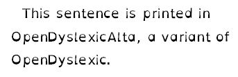
Note how the letters are (1) san serif and (2) are heavier at the bottom, thereby ‘anchoring’ them to the line and preventing them from ‘floating’ or twisting on the page.
Rello and Baeza-Yates performed eye-tracking and reading speed experiments on a number of subjects aged 11-50, and when you plot their data—eye fixation duration against reading time—you learn the preferred typefaces are Arial and OpenDyslexic. That is, their subjects demonstrated that documents printed these two typefaces required short eye fixations times, which, in turn, shortened reading times.
Unfortunately, there are not many books published using the OpenDyslexic typeface, though the few that have been are cited on Goodreads. These include The New Testament printed in paperback using OpenDyslexic (this version of the Bible was developed by Abelardo Gonzalez.)
To summarize, while Amazon’s Kindle eReaders do not support the OpenDyslexic typeface at this time, readers using this and other eReaders with dyslexia should experiment with various typefaces, background colors, and line spacings as a way to improve their reading experience. As well, audio and paperback books printed using special fonts such as OpenDyslexicAlta can help readers who struggle with the hidden disability known as dyslexia increase their enjoyment of the literature.
Theodore J. Cohen, Ph.D.,
of Middletown, is the author of the award-winning Young Adult (YA) novel The Hypnotist, which he wrote under the penname Alyssa Devine. The novel is available in both a regular edition and one for readers with dyslexia: http://www.amazon.com/dp/1514789337
Subscribe
If you enjoyed this article, subscribe to receive more just like it.