I DON’T KNOW of any industry that purposely would give up 20% of its potential markets without a fight. Yet, mistakes we make in the selection of typefaces, formats, and backgrounds can indeed have that effect.
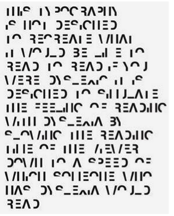
What I am speaking of is the fact that one in five students, or 15-20% of the population, has a language-based learning disability, with dyslexia being the most common of the language-based learning disabilities. Importantly, approximately the same percentage of males and females have dyslexia. For clarity, kids with dyslexia have trouble reading accurately and fluently. They may also have trouble with reading comprehension, spelling, and writing (see goo.gl/dAFaeP). Not being dyslexic myself, I sought insight into the problem from someone who was: UK graphic designer Daniel Britton. What he revealed was startling. What Britton did was to design a typeface intended to recreate for non-dyslexic readers the frustration and embarrassment people with dyslexia experience when they attempt to read newspapers, books, and other literature most people are able to read every day of their lives (http://danielbritton.info/dyslexia). An example of simple text rendered in this typeface is shown below:

Not a pretty picture, is it?! Were you able to decipher it?
Take heart. The situation is not hopeless. It was Britton’s work that inspired me to move forward with the creation of a special edition of my YA novel, The Hypnotist, for readers with dyslexia. Here, I completely reformatted the text using the free, OpenDyslexicAlta typeface (http://opendyslexic.org/). Bottom heavy, with unique character shapes, the OpenDyslexicAlta typeface helped make it more difficult for the reader to confuse letters. I also eliminated the text’s right justification, which confuses dyslexics. The final text was sufficiently “dyslexic friendly” as to win the endorsement of the American Dyslexic Association and the Wisconsin Institute of Learning Disabilities/Dyslexia (WILDD).
Admittedly, changing the typeface for your paperback book to meet a subset of your potential readership is a time-consuming effort, and there is no guarantee the return on investment will prove worthwhile. (NB An Open Dyslexic typeface is available on all Kindle readers; check availability on other eReaders you are considering.) But there are other things you can be doing as you prepare your books, including your eBooks, for publication that will help those suffering from language-based learning disabilities.
- I’ve already mentioned dropping right-justification in your text. This will help the reader maintain line-to-line continuity.
- Use a sans serif typeface (e.g., Arial, Comic Sans, Verdana, and others). For my series of illustrated children’s storybooks in verse, I use Segoe Print.
- Increase the spacing of the letters and/or the lines over that normally used.
- If you are embedding text within your images/graphics, as many do in children’s storybooks today, especially for eReader presentation, be careful to ensure the text is not masked or “entangled” in the artwork.
- Be careful about changing letter colors or font sizes within the same sentence . . . it can be confusing.
Finally, as for students with dyslexia who use eReaders, have them experiment with typefaces as well as with letter and background colors (e.g., try using blue-colored text on a white background or even black text on a light blue/pink/yellow background). You and they may be pleasantly surprised with the results.
The items cited above are things we, as authors, can do to help students suffering from language-based learning disabilities. Best of all, many are easy to implement.
Theodore Jerome Cohen, PhD, authored and illustrated the children’s series Stories for the Early Years. He also writes YA novels under the pen name Alyssa Devine. You can visit him at www.theodore-cohen-novels.com or www.alyssadevinenovels.com. Member, SCBWI.
This article originally appeared in the Winter, 2018, edition of BULLETIN, the journal of the Society of Children’s Book Writers & Illustrators (SCBWI). Reprinted by permission of the author.

